
The 2026 FIFA World Cup Logo Design Review

The FIFA World Cup is one of the most celebrated sporting events in the world, uniting millions of fans across continents. With the unveiling of the new logo for the 2026 FIFA World Cup, anticipation is growing—but so is debate. The design has sparked mixed reactions within the football and design communities. In this article, we’ll take a closer look at the 2026 logo, its aesthetic qualities, symbolic meaning, and how it fits into the tournament’s legacy.
2026 FIFA World Cup tournament will take place from June 11 to July 19, 2026. It will be jointly hosted by 16 cities in three North American countries.
FIFA 26 Countdown
2026 FIFA World Cup Logo
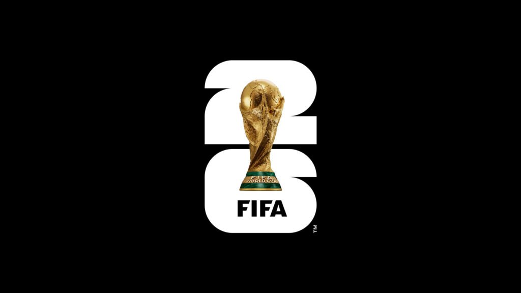
The official 2026 FIFA World Cup logo introduces a bold and modern approach.
- At its core is the number “26”, representing the year of the tournament and emphasizing the milestone nature of this edition.
- Sitting atop the number is a realistic depiction of the World Cup trophy, symbolizing the ultimate achievement in football and paying tribute to the rich history of past tournaments.
- Beneath the design sits the word “FIFA”, a seal of authenticity and credibility from the governing body of global football.
The result is a clean, straightforward mark that highlights both heritage and anticipation.
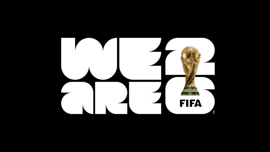
We Are 26 | 2026 FIFA World Cup Logo
Despite its bold presence, the logo has faced criticism:
- Many argue that it is too simple compared to previous World Cup logos, which were often vibrant, intricate, and culturally rich.
- World Soccer Talk even described it as “uninspiring” and “overly simplistic,” questioning whether it captures the true essence of the World Cup.
Simplicity as a Statement
Supporters, however, defend the logo’s minimalism.
- They view the clean design as a conscious choice—representing a modern, digital-first World Cup.
- Its adaptability across merchandise, digital platforms, and global branding is seen as a strength rather than a weakness.
- In line with current design trends, simplicity allows for universal recognition.
Symbolism, Unity, and Legacy
Unlike the intricate designs of previous tournaments, the 2026 logo emphasizes clarity and unity.
- It symbolizes the joint hosting by the United States, Canada, and Mexico—a first in World Cup history—through a shared, neutral aesthetic.
- The combination of the number 26 with the trophy projects both strength and prestige.
- It bridges past traditions with a new era, serving as a visual reminder of the World Cup’s evolving identity.
Final Thoughts
The 2026 FIFA World Cup logo may not carry the elaborate artistry of its predecessors, but it makes a powerful modern statement. With its bold typography and iconic trophy centerpiece, it reflects anticipation, grandeur, and legacy—qualities that define the World Cup itself.
Whether loved or critiqued, the logo has succeeded in one thing: sparking global conversation. As fans await the kickoff in 2026, this emblem will serve as a lasting symbol of football’s most prestigious tournament entering a new era. | Sources: fifa.com


Comments are closed.